Work
ECPC
Eastern Connecticut Pathology Consultants
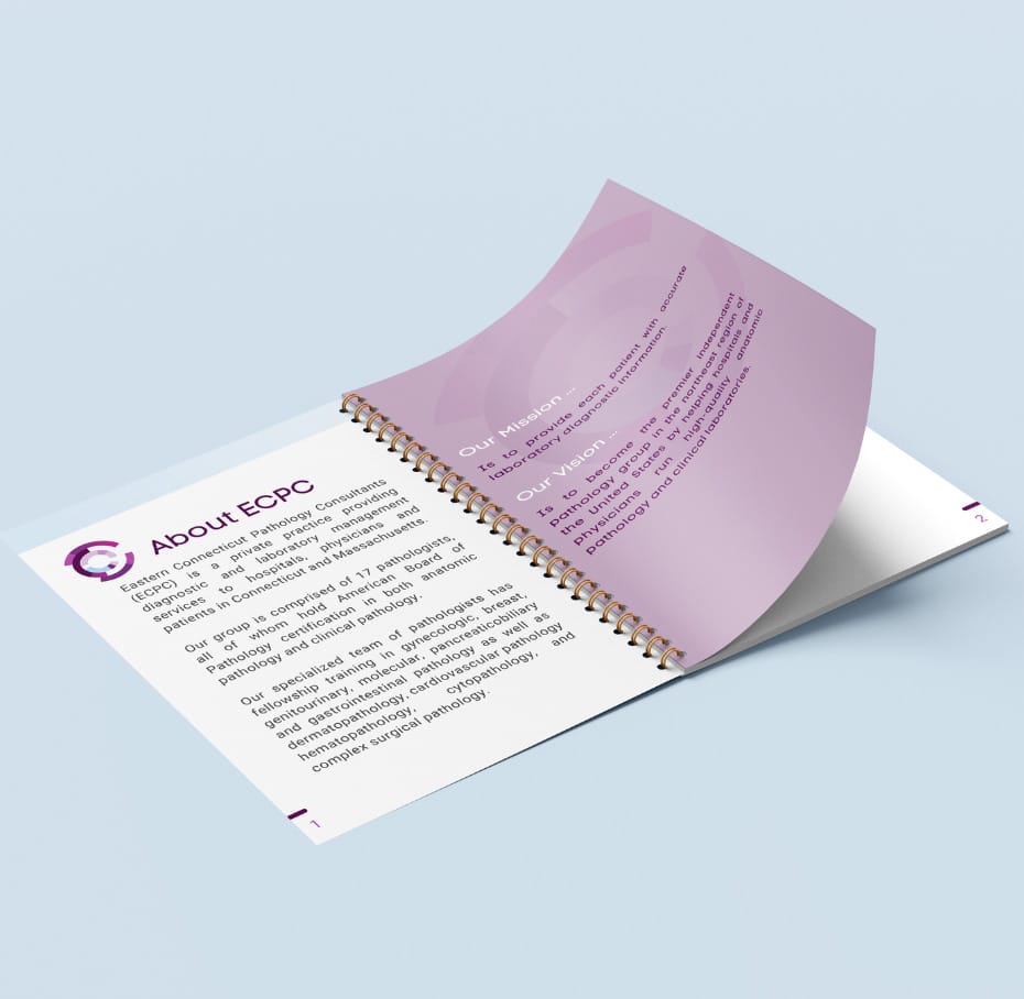
About
When we partnered with ECPC, we set out to break the boundaries of healthcare design. We agreed to eschew any design tropes for this multi-state pathology group, such as microscope silhouettes, and to lean more toward abstraction to convey a sense of forward-thinking ideas and innovation.
Deliverables
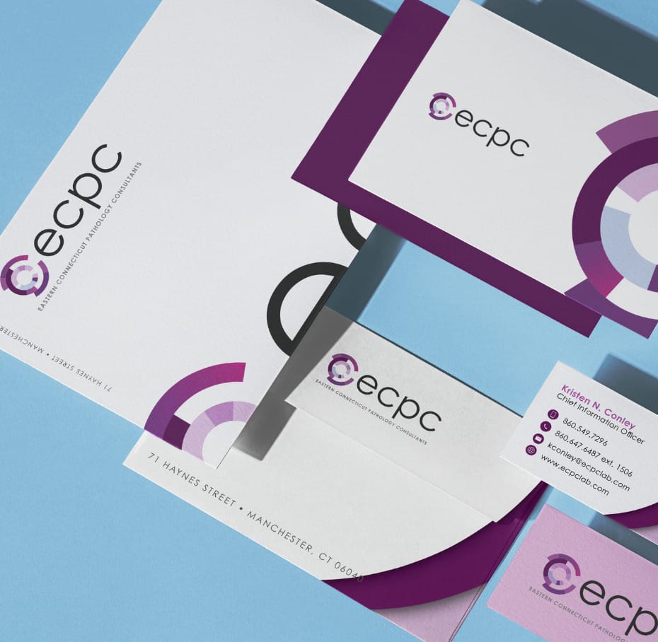
- Brand identity
- Brand strategy
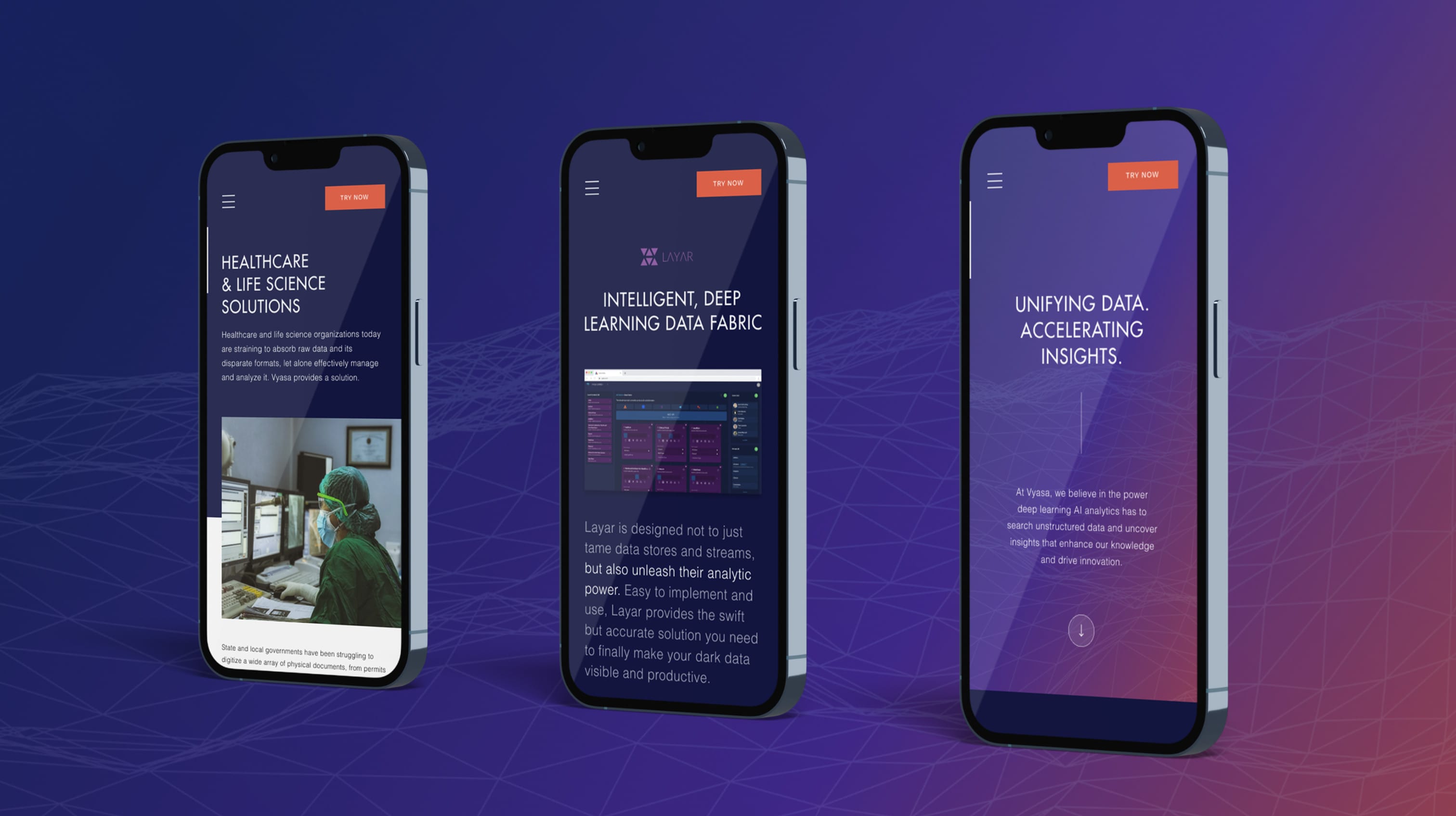
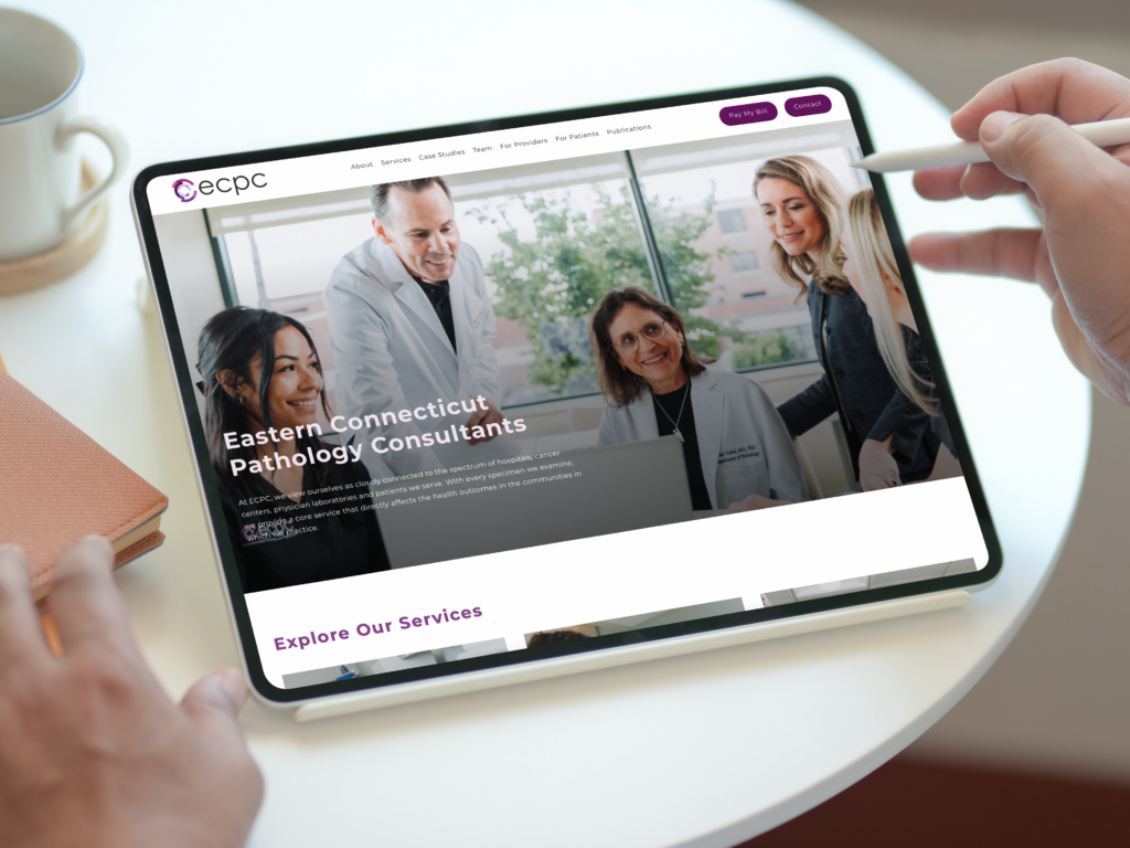
- Website design
- Content development
- Photography
- Signage
- Print and digital collateral
Industry
Healthcare
Lab Management
How it started
Healthcare branding is typically very safe, especially among hospitals and health systems. Logos need to visually register with the diverse patient populations they serve, so they often incorporate easily-recognizable icons, simplistic design and shades of blue. In most cases, logos with deep-seeded brand recognition have been in place for decades without changes.
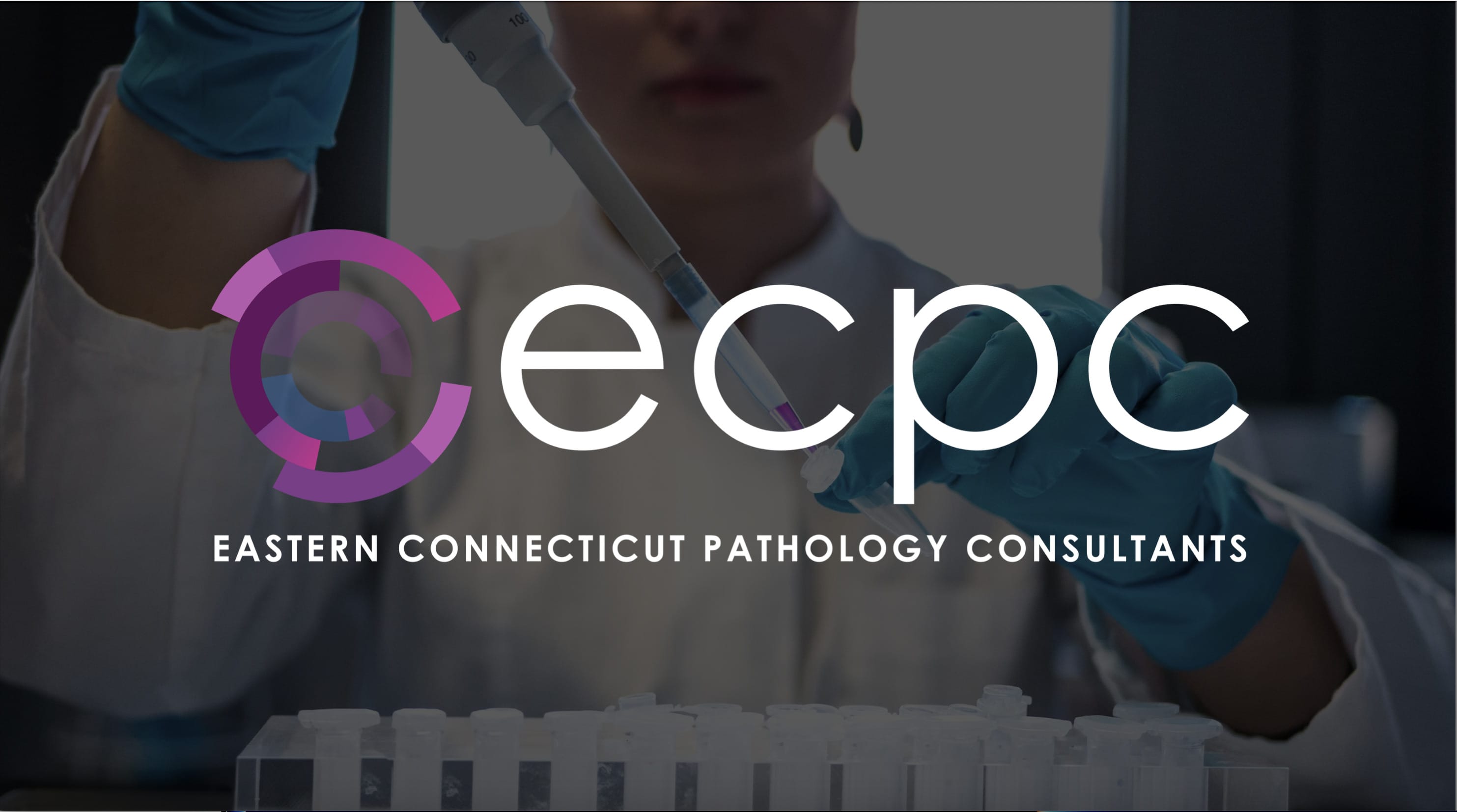
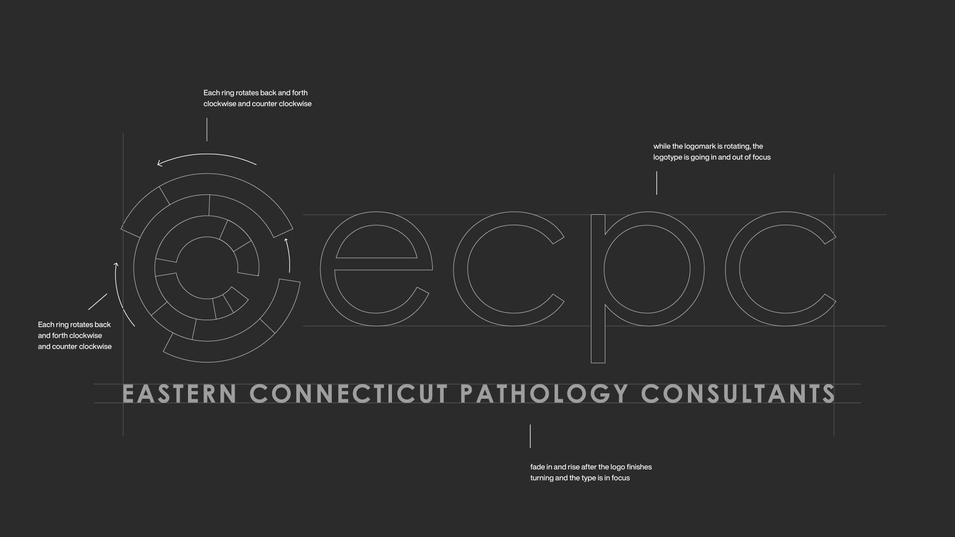
The leadership team at ECPC was refreshingly open to creative ideas to modernize their brand. Our award-winning brand design is a representation of the interior view of a microscope’s ocular lens, which we animated for the practice’s brand launch.
In the animated version, the lens turns clockwise and counterclockwise as the full logo gradually comes into focus, as if the viewer is zooming in on a specimen.


Our work for ECPC has consistently received recognition for excellence from the New England Society for Healthcare Communications.
Our brand redesign won a Gold Lamplighter Award as best healthcare logo in New England in 2020.
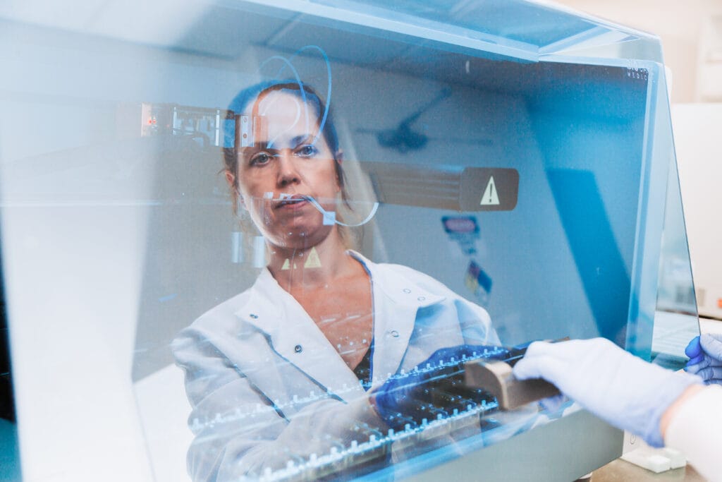
Two years later, our brand photography submission “Humanizing the Lab” won a Silver Lamplighter Award. The photo highlighted the lab technicians working behind the scenes during the pandemic, with an artistic shot showing the tech seeing her own reflection in the blue-tinted pane of lab equipment.